01
Stroke weight
Thin strokes may disappear at small stone sizes. Confirm the minimum stroke the chosen stone size can represent before production.
Every character is a stone layout decision. Stroke weight, counter space, letter spacing, and viewing distance all determine which stone size and map will produce a legible, consistent result on the intended garment.
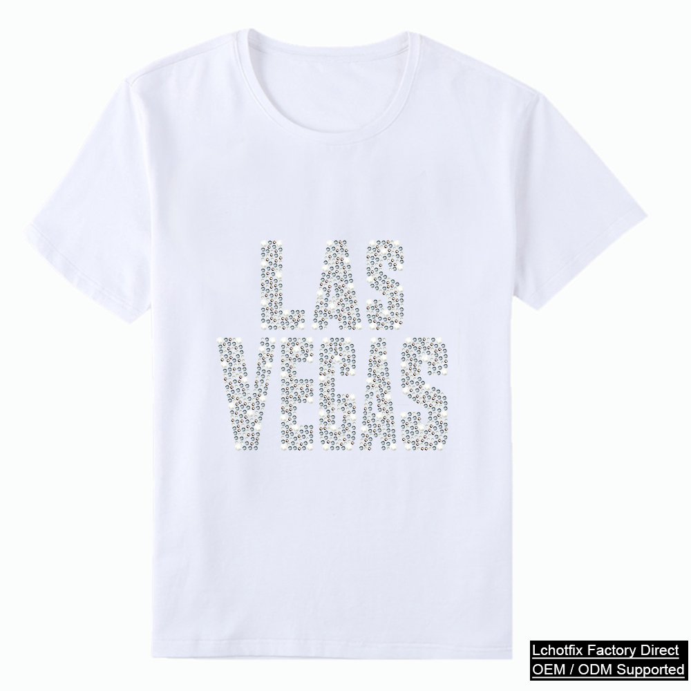
A letter or number that reads clearly in print does not automatically read clearly in rhinestones. Each character requires its own legibility check at the intended size and stone scale.
Thin strokes may disappear at small stone sizes. Confirm the minimum stroke the chosen stone size can represent before production.
Letters like A, B, D, O, P, Q, R require open interior spaces that must remain legible after application.
Inter-character gaps set the visual rhythm. Too tight and letters blur; too wide and the word loses cohesion.
Confirm the character height at final size — not a proportionally scaled thumbnail — before approving the stone map.
A jersey number read from stands, a bag monogram handled at arm's length, and a cap detail seen in-store are different problems.
The legibility check happens on the actual stone map, not on a logo or font reference. Approve the map, not the typeface.
Not every font converts cleanly. Very thin strokes, tight letter spacing, small counters, and complex serifs may require simplification. Submit the intended font or lettering artwork with the finished size and intended garment for feasibility review.
The correct size depends on the viewing distance, stone size used, garment or product, and buyer intent. Small accent lettering and full-back name arcs are both possible, but each has different stone layout, garment compatibility, and approval requirements.
Submit authorized team artwork, approved number styles, and the receiving garment details for feasibility review. Uniform and jersey programs often have specific placement tolerances, size requirements, and care standards that must be captured in the written specification.
Larger stones (SS10 and above) produce fewer stones per letter and suit bold, widely-spaced characters. Smaller stones allow more detail in tighter letterforms but increase stone count and mapping complexity. The approved map and sample determine the final selection.
A letter or number that reads clearly in print does not automatically read clearly in rhinestones. Each character requires its own legibility check at the intended size and stone scale.
Thin strokes may disappear at small stone sizes. Confirm the minimum stroke the chosen stone size can represent before production.
Letters like A, B, D, O, P, Q, R require open interior spaces that must remain legible after application.
Inter-character gaps set the visual rhythm. Too tight and letters blur; too wide and the word loses cohesion.
Confirm the character height at final size — not a proportionally scaled thumbnail — before approving the stone map.
A jersey number read from stands, a bag monogram handled at arm's length, and a cap detail seen in-store are different problems.