Clear / Crystal
Maximum light reflection. Reads as white light on most garments. High contrast on dark substrates.
Every rhinestone color reads differently on different garments, under different lighting, and from different viewing distances. The stone chart and physical sample are the only reliable approvals — not a screen color picker.
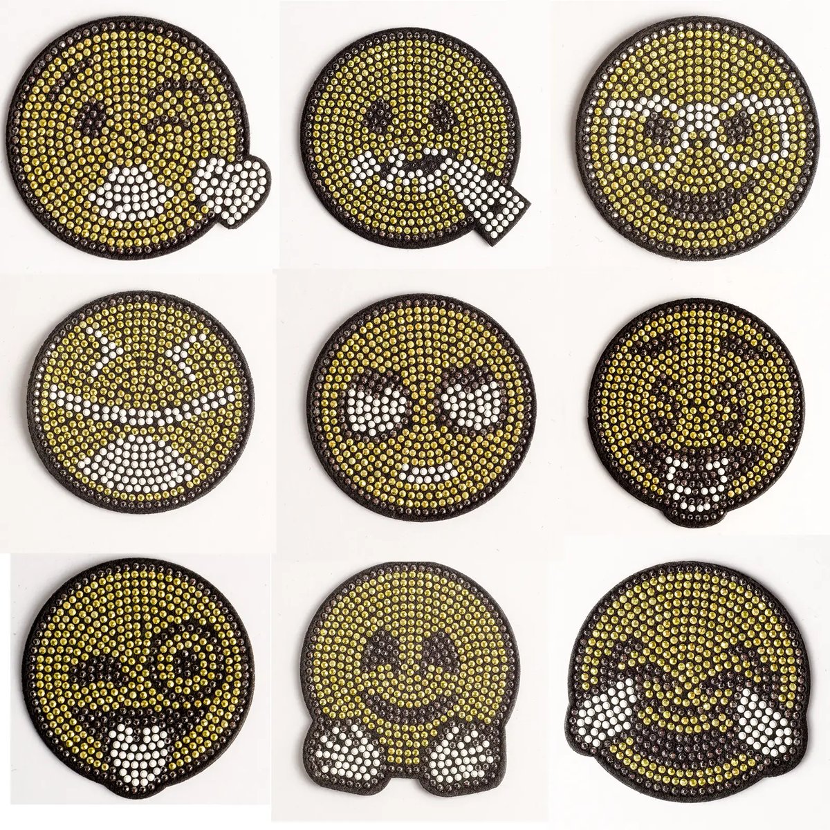
Each family behaves differently on different garment colors and under different lighting. The current stone chart and physical sample are the definitive references.
Maximum light reflection. Reads as white light on most garments. High contrast on dark substrates.
Iridescent multi-colour shift. Appearance changes significantly with lighting angle and garment color.
Warm amber to gold tones. Works with earth tones, cream, black, and navy substrates.
Absorbs light rather than reflecting it. Creates graphic contrast on light garments.
Red, blue, green, pink, and other single-hue stones. Each has distinct light behavior at different saturation levels.
Multiple stone colors in one transfer. Each color zone requires its own reference and alignment decision in the approved map.
Color swatches above are illustrative only — never a production approval. Use the current LCHOTFIX stone chart for actual color references.
The current physical stone chart is the reference. Colors shift between suppliers, batches, and catalog versions.
Dark garments amplify contrast and sparkle. Light or bright garments can reduce the effective visual separation between stone and base.
Studio lighting, stage lighting, retail fluorescents, sunlight, and blacklight each produce different stone appearance results.
Color precision matters more at close range. A 30 cm transfer seen from 5 m requires less color precision than a 5 cm chest motif seen at arm's length.
When a transfer uses more than one stone color, every zone requires its own stone reference, spacing rule, and alignment confirmation in the artwork map. Color-map edits after the color map is signed off should be checked on a fresh decorated swatch before the transfer run continues.
Mark each color zone on the approved artwork. Zones that share a stone row or border require specific spacing decisions.
Assign a current stone chart code to each zone. Do not use color names alone — the same name can describe very different stones across batches.
Confirm each zone reads clearly against the specific garment color and surface.
The color approval happens on a physical sample applied to the actual garment — not on a screen mockup or color proof.
A screen image can support initial orientation but is not a production approval. Display calibration, photography conditions, garment color, and stage or retail lighting all affect how a rhinestone reads. Use the current stone chart and a physical sample to confirm the final color selection.
The garment color changes how a rhinestone reads. A clear or light-color crystal on a dark garment catches more contrast and sparkle. On a light garment, the same stone may appear less defined. Color selection decisions must account for the actual garment color and fabric finish.
AB stands for Aurora Borealis — a multi-colour iridescent coating applied to the stone surface. AB stones shift colour under different lighting angles and are recorded in several LCHOTFIX catalog references including the AB crystal baseball cap. The AB effect is confirmed by physical sample, not screen preview.
Multiple stone colors in a single transfer are possible. Each color is a separate production decision — its stone reference, spacing relationship to adjacent colors, and visual separation must all be confirmed in the artwork map before sampling.
Each family behaves differently on different garment colors and under different lighting. The current stone chart and physical sample are the definitive references.
Maximum light reflection. Reads as white light on most garments. High contrast on dark substrates.
Iridescent multi-colour shift. Appearance changes significantly with lighting angle and garment color.
Warm amber to gold tones. Works with earth tones, cream, black, and navy substrates.
Absorbs light rather than reflecting it. Creates graphic contrast on light garments.
Red, blue, green, pink, and other single-hue stones. Each has distinct light behavior at different saturation levels.
Send the garment, artwork, stone chart references, intended lighting, and quantity.