Square fields
Compare the straight rows in broad strokes with the shorter rows beside a diagonal. The black spaces between squares remain visible.
Square crystals form the interior grid while small round stones articulate the edge and letter details.
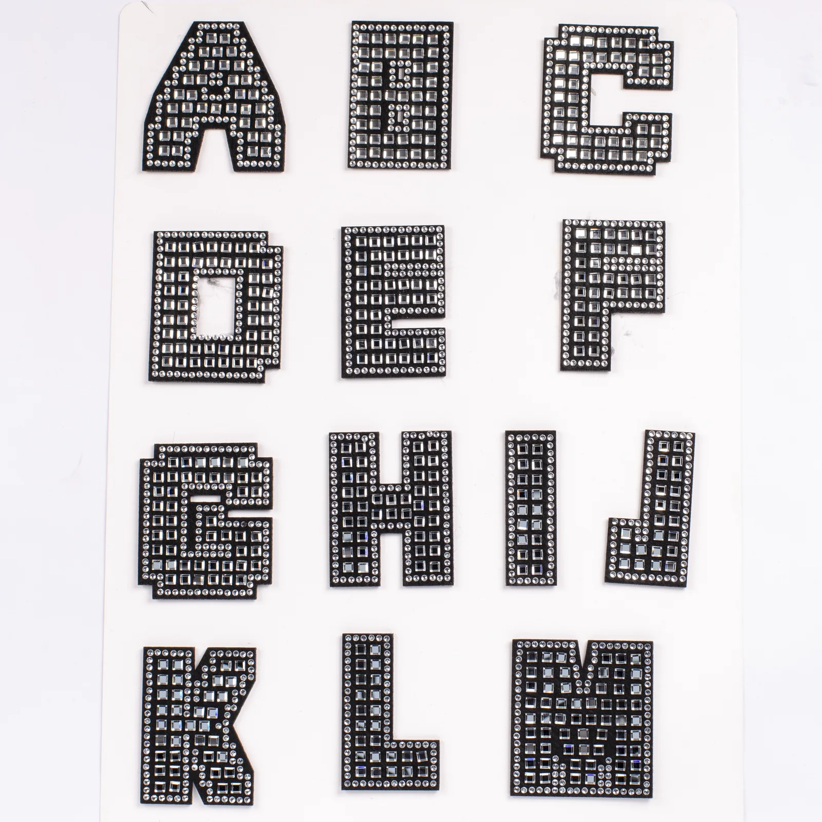
The close A and K views show square stones arranged through broad black strokes, with round stones following the outline and occupying narrower junctions. The square layout changes around diagonals and openings rather than forming one uninterrupted rectangular mesh. Use those transitions to choose the letter style and identify the parts of the pattern to retain.
Reference measurements come from the catalog record. The current MOQ is 50 pieces; confirm specifications, price, and lead time in writing before production.
Compare the A's crossbar with the K's diagonal junction. These close views show why the selected character matters as much as the general alphabet style.
Compare the straight rows in broad strokes with the shorter rows beside a diagonal. The black spaces between squares remain visible.
On the A, round stones bridge areas around the crossbar and inner opening where the square arrangement changes.
The K close view brings vertical and diagonal strokes together. Inspect the mixed stone shapes at that meeting point instead of treating the whole face as a uniform grid.
Small round edge stones and larger square faces have different visual rhythms. Keep both in view when comparing this alphabet with all-round crystal lettering.
The design decision is which arrangement should remain visible at the intended scale. Order quantities and revision approvals are handled in the linked purchasing resource.
Select the character and identify which of its strokes carry repeated square rows.
Trace the smaller stones around corners, openings and the outside edge without assuming every character uses the same spacing.
Mark where a diagonal, crossbar or narrow area changes from square to round stones.
Save the chosen arrangement with its intended word or initial layout; distinguish any proposed pattern change from the pictured version.
Compare an initial's wide and narrow strokes to decide whether its square fields create the focal point you want.
Review neighboring straight and diagonal characters together. Their grid transitions should remain recognizable in the complete word.
Place this grid reference beside an all-round alphabet and compare edge rhythm, dark spacing and the visual weight of the stone faces.
Finished height matters here because the square grid and small interior openings must remain legible in the chosen characters. For further detail, consult Square & Round Crystal Alphabet Patches in Bulk. For the separate purchasing workflow, see Square-Grid Crystal Alphabet Order Specs.
Square centers and round perimeter stones create a visibly different rhythm from conventional all-round lettering.
Regular square spacing emphasizes the straight sides and broad faces of the uppercase forms.
Smaller round crystals keep openings such as A, B, D, and R legible within the dense layout.
The wide block shapes suit single initials and short combinations that can carry a substantial crystal field.
List every initial or phrase, the count per letter, and the available placement area so the mixed-stone grid can be reviewed at scale.
Share the final sequence of letters and the number of completed sets.
Review how square rows and round borders translate at the requested scale.
Approve a character with counters or diagonal strokes before the full alphabet mix proceeds.
Confirm grouping and labels for the approved custom letter assortment.
Send your artwork, quantity, destination, and specifications for a tailored quote.