Inset, not outer edge
A black margin remains outside the pink path. Compare that margin with the larger black field inside the letter stroke.
A narrow reflective-pink inset brightens precise black uppercase letters without a dense crystal fill.
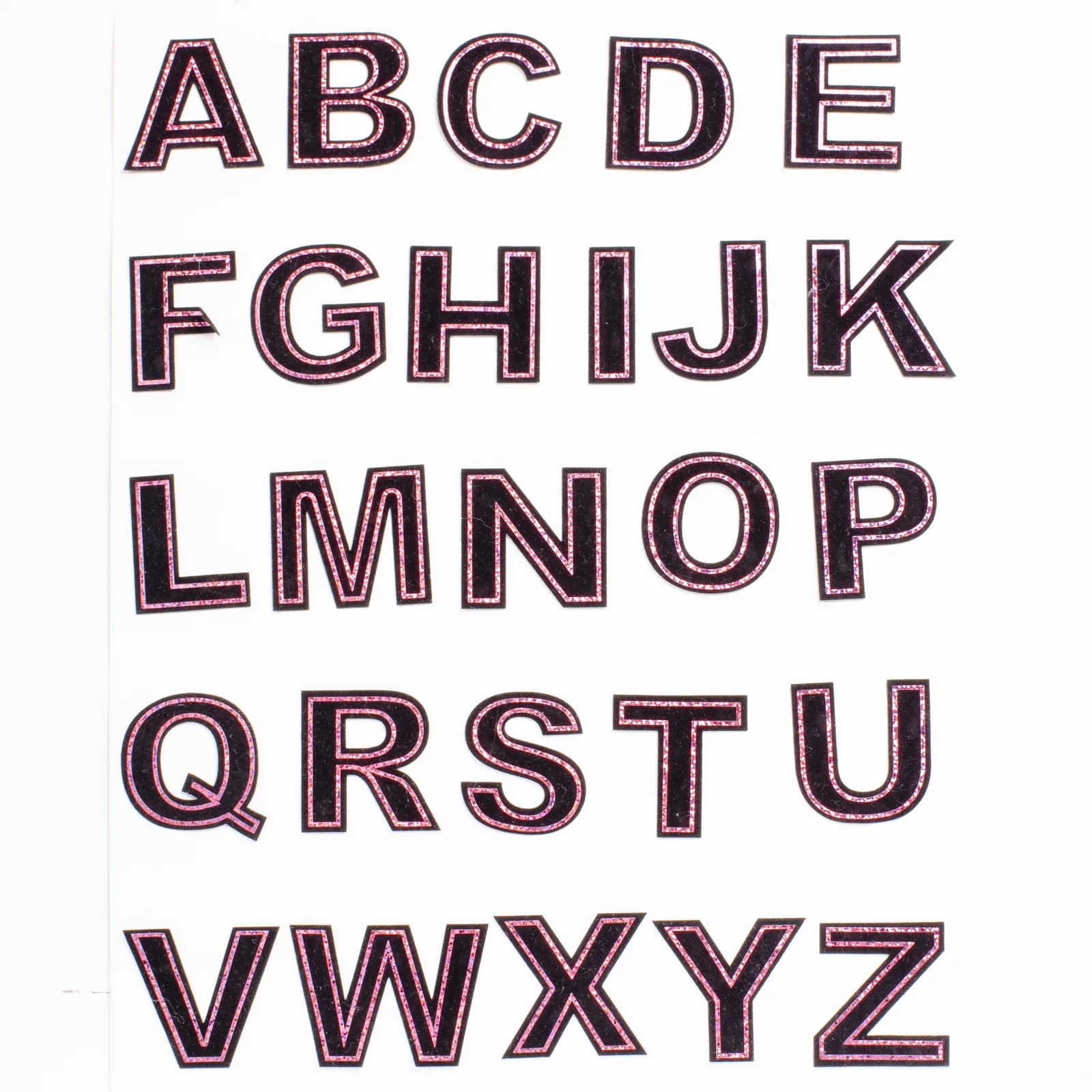
The A and B close view shows a narrow pink reflective strip inset from the outer black edge and repeated around the enclosed openings. Small light and dark flecks are visible within the strip; it is not a row of separately set round crystals. The broad black areas carry the letter shape while the inset follows its boundaries.
Reference measurements come from the catalog record. The current MOQ is 50 pieces; confirm specifications, price, and lead time in writing before production.
The close A and B photograph separates the continuous pink strip from the black carrier. Compare its outer and inner paths before requesting a visual variation.
A black margin remains outside the pink path. Compare that margin with the larger black field inside the letter stroke.
The A's triangular opening and the B's two rounded openings each have their own pink boundary. Keep those inner paths in the artwork selection.
The close view contains several pink and pale reflective flecks within a continuous strip. A flat pink screen swatch cannot describe that visible texture by itself.
Compare the A's sloping sides with the B's bowls. The same narrow inset creates a different rhythm along corners and curves.
The visual record identifies which outline and reflective texture you selected. Physical finish approval, quantity allocation and protective packing belong in the separate order specification.
Select the intended characters from the alphabet view and note their straight, curved and enclosed areas.
Compare the pink path with the outer black margin and the interior black field.
Keep the flecked reflective reference visible when annotating any change to the pink appearance or path.
Review the characters together in the intended composition and retain the chosen visual reference beside the drawing.
Compare the narrow pink paths across the complete word on the proposed background, especially where neighboring letters have different openings.
Choose this outline-led appearance when the black letter field should remain prominent beside its reflective accent.
Check long and short names as layouts rather than treating an enlarged A or B close-up as a preview of every combination.
Approve the metallic pink reference and the target height together, because both affect how the narrow outline reads on each character. For further detail, consult Pink Metallic Outline Letter Patches Wholesale. For the separate purchasing workflow, see Pink Metallic Letter Patch Order Specs.
A single metallic path follows the letter perimeter and repeats through enclosed counters.
The broad dark field preserves a clean typographic face between the narrow outline tracks.
Crisp terminals and consistent stroke widths support orderly names and team identifiers.
The design gains shine from an outline rather than covering the complete character surface.
Provide the complete character inventory, units per letter, receiving product, and metallic tone instead of ordering an undefined alphabet mix.
Convert the requested names into a precise per-letter quantity list.
Confirm the metallic tone and black field at the chosen character height.
Inspect corners, counters, and inset alignment on representative letters.
Select alphabetic or name-based packing before the finished mix is released.
Send your artwork, quantity, destination, and specifications for a tailored quote.