Continuous pink inset
A single metallic path follows the letter perimeter and repeats through enclosed counters.
A narrow reflective-pink inset brightens precise black uppercase letters without a dense crystal fill.
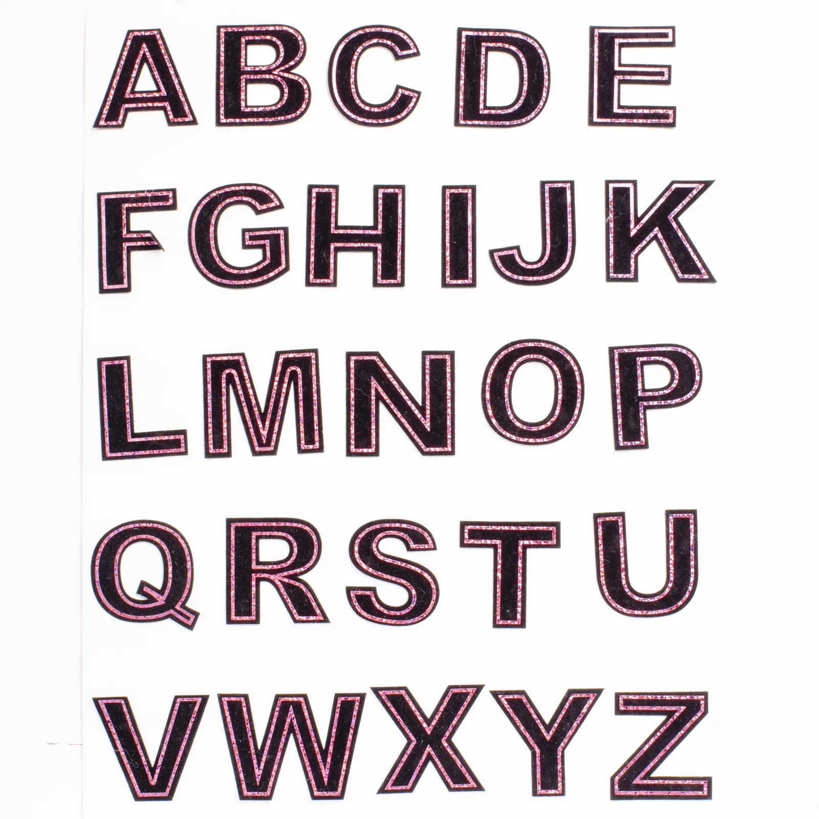
These slim block characters pair a black laser-cut textile body with a continuous pink metallic line set just inside the edge. The restrained two-tone construction keeps long names readable while giving every letter a distinct reflective accent.
Reference measurements come from the catalog record. The current MOQ is 50 pieces; confirm specifications, price, and lead time in writing before production.
Approve the metallic pink reference and the target height together, because both affect how the narrow outline reads on each character.
A single metallic path follows the letter perimeter and repeats through enclosed counters.
The broad dark field preserves a clean typographic face between the narrow outline tracks.
Crisp terminals and consistent stroke widths support orderly names and team identifiers.
The design gains shine from an outline rather than covering the complete character surface.
Provide the complete character inventory, units per letter, receiving product, and metallic tone instead of ordering an undefined alphabet mix.
Convert the requested names into a precise per-letter quantity list.
Confirm the metallic tone and black field at the chosen character height.
Inspect corners, counters, and inset alignment on representative letters.
Select alphabetic or name-based packing before the finished mix is released.
Compose clear group identifiers whose narrow pink edge reads against black uniforms or bags.
Add a restrained metallic monogram when an all-crystal letter would feel too dense.
Prepare first-name assortments using a verified count of repeated vowels and common initials.
The recorded material is a pink metallic inset on a black laser-cut textile base. Do not substitute a crystal-letter specification when requesting this particular reference from LCHOTFIX.
Provide the available word width and desired letter height, with the exact spelling. LCHOTFIX needs those measurements to review individual letter widths and spacing.
Use a physical sample where possible and compare it under the intended lighting. A screen image alone is insufficient to approve the color and reflectivity of a metallic finish.
Check the contour around corners, internal openings and the boundary between the pink inset and black base. Keep the approved sample as the construction reference.
It does not establish a temperature, pressure or dwell time. Ask LCHOTFIX for the confirmed backing and material-specific application guidance, then test on the actual substrate.
Specify the replacement finish and identify the black center as unchanged. LCHOTFIX must review material availability and a sample before confirming that variation.
Break the team list down into quantities of each character, including repeated initials. State sizes separately so the written quote covers the real letter distribution.
Evaluate attachment, edge condition and changes in the metallic appearance under the proposed care process. Do not publish wash-durability claims before the selected construction has been tested.
Ask LCHOTFIX to review face separation and letter sorting for your order. Confirm the agreed packing materials and quantities rather than assuming a protective retail pack is standard.
Retain the approved metallic sample, letter dimensions, outline proportions and application specification. Reference those details when requesting a repeat quotation.
Send your artwork, quantity, destination, and specifications for a tailored quote.