Detail 01
Mixed crystal geometry
Square and round elements should look intentional together. Check grid orientation and edge continuity rather than evaluating sparkle from a distant photograph only.
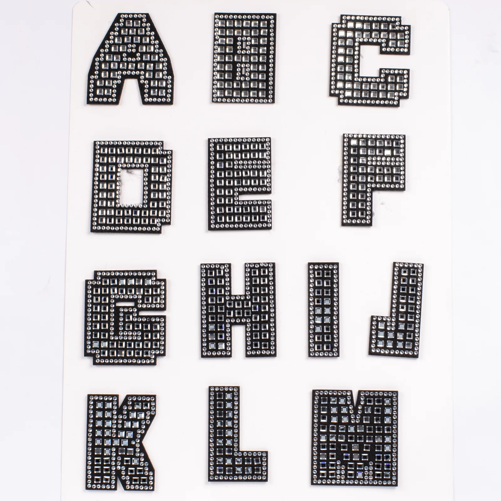
Give initials and words a tiled, architectural sparkle. Square crystals establish the inner grid while round stones sharpen the outline, producing a visibly different alphabet for fashion, group merchandise, and accessory personalization.

Square and round elements should look intentional together. Check grid orientation and edge continuity rather than evaluating sparkle from a distant photograph only.
The dark base creates a consistent silhouette between crystal rows and helps the uppercase forms remain readable when light changes.
Plan letters from actual names, slogans, or sales history. Balanced A-to-Z packs can overstock uncommon characters and understock vowels.
A single letter turns the grid structure into a clear focal point on bags, outerwear, or fabric accessories.
Test spacing between separate patches and proof the entire word as a placement mockup before production.
Map roster characters, extras, and replacements, then test attachment on the exact uniform construction.
Use a documented inventory table so popular initials can be replenished without silently changing the crystal style.
Quote the catalog code and attach the reference image to protect the square-grid construction.
Record requested quantities per character and confirm the order reaches the current 50-piece MOQ.
Inspect geometry, base edges, back construction, application sample, finished spelling, and sorting labels.
No. The photography shows square clear crystals forming an internal grid and smaller round crystals tracing the perimeter and selected internal lines. That mixed geometry is the defining visual feature.
Current MOQ: 50 pieces. The quote still depends on a complete character allocation, because fifty mixed letters is a different production request from fifty identical initials.
Review row direction, spacing, edge alignment, missing-stone risk, corner treatment, and whether the letter remains legible. Approve a representative sample under normal viewing conditions.
Separate styles can be requested, but each family should keep its own code, quantity table, sample approval, and packing instruction. Mixing constructions inside one word may create inconsistent weight and visual rhythm.
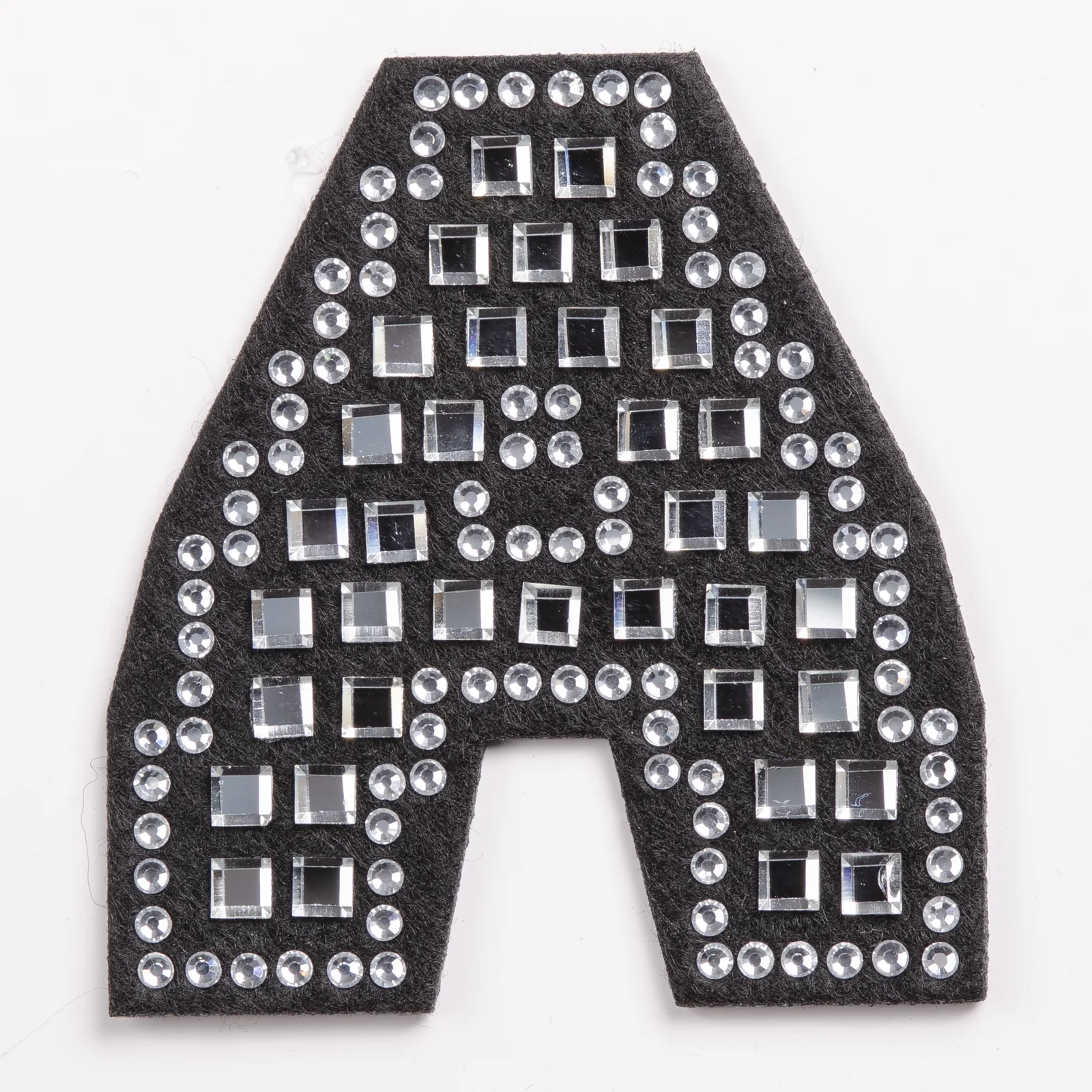
The A sample reveals stepped square rows, a round-stone perimeter, and the treatment around the center opening.
Square and round elements should look intentional together. Check grid orientation and edge continuity rather than evaluating sparkle from a distant photograph only.
The dark base creates a consistent silhouette between crystal rows and helps the uppercase forms remain readable when light changes.
Plan letters from actual names, slogans, or sales history. Balanced A-to-Z packs can overstock uncommon characters and understock vowels.
A single letter turns the grid structure into a clear focal point on bags, outerwear, or fabric accessories.
Test spacing between separate patches and proof the entire word as a placement mockup before production.
A useful request identifies the exact product family, required characters, quantity per character, receiving item, target placement, destination, and date. Current MOQ: 50 pieces; the written quote confirms the assortment and current terms.