Segmented square boundary
The square stones turn around rounded edges as separate faces, with white space between them rather than one continuous reflective strip.
Soft white letter shapes combine a square-stone border with scattered round accents and occasional pink highlights.
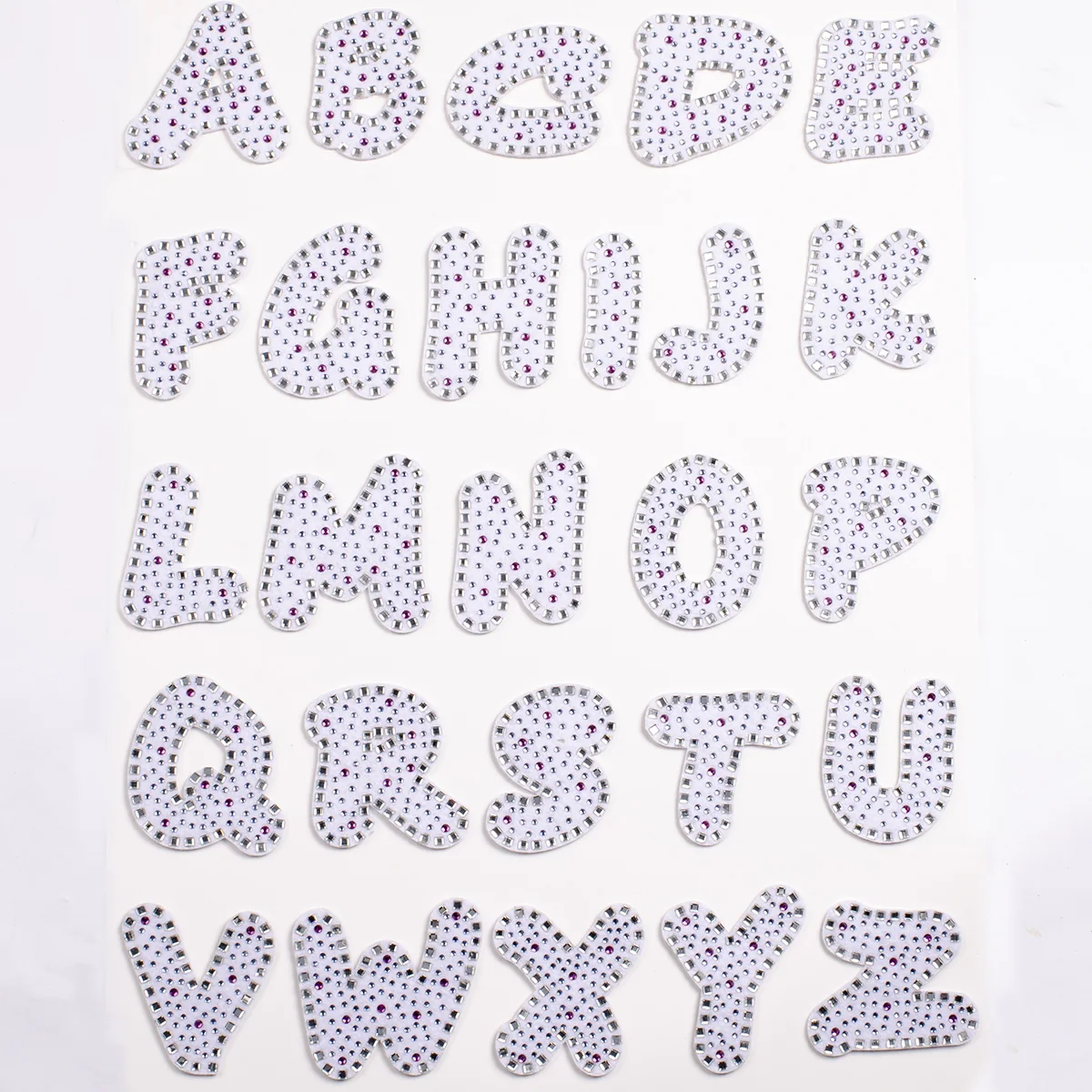
The alphabet board shows rounded white forms with separated square stones along their boundaries and smaller round accents across the exposed textile. Pink-looking points interrupt the paler interior pattern. In the ring-shaped O close view, both the outer curve and inner opening carry square stones; the white gaps remain part of the letter's appearance.
Reference measurements come from the catalog record. The current MOQ is 50 pieces; confirm specifications, price, and lead time in writing before production.
The O close view makes the segmented edge and open interior easy to separate. Compare it with the broader alphabet before choosing a rounded initial or word.
The square stones turn around rounded edges as separate faces, with white space between them rather than one continuous reflective strip.
The O close view lets you compare square placement around two different curves. A letter without an enclosed opening will distribute those boundary stones differently.
Small round accents sit within a clearly visible white carrier. Compare the exposed area with fully filled crystal lettering before choosing the effect.
Pink-looking accents are spread through the board and O close view. Mark their positions if a revised palette is wanted; a color name alone does not preserve the pattern.
Use the visible shape and stone positions as the design key. Garment-color approval, kit quantities and clean handling are separate purchasing decisions.
Use the board and close image to confirm the actual shape, including any inner opening and rounded terminal.
Mark square stones around the outside and any inner opening, keeping the exposed white gaps visible.
Separate small round accents from colored highlights and record the positions you want retained.
Compare the selected character on the intended background and keep the original view beside any proposed change.
Compare the letter outline against the chosen background to decide whether its white carrier should blend in or remain visible.
Review rounded counters and neighboring letters together. The loose interior scatter and square boundary should remain distinguishable in the full name.
Choose whether the colored points repeat a common visual theme or vary by initial, and mark those choices on the artwork reference.
Review accent density on the actual letters you need, since open counters and rounded strokes distribute the pink stones differently. For further detail, consult White Square-Crystal Letter Patches Wholesale. For the separate purchasing workflow, see White Crystal Alphabet Patch Order Specs.
Rectangular crystals form a segmented border that is especially visible around curved letter shapes.
Uncovered textile remains between the interior stones, keeping the characters light rather than fully paved.
Soft corners and varied playful forms give the A–Z set a casual personality.
Small colored points interrupt the clear-stone pattern without replacing the predominantly white appearance.
The buying brief should name each character, its quantity, the finished scale, and whether the pictured pink accents should be retained.
Identify the initials or names and calculate their repeated letters.
Review the rounded shapes and square border at the requested height.
Approve the relationship between clear stones, pink points, and exposed white textile.
Choose character-by-character packing for the approved personalization program.
Send your artwork, quantity, destination, and specifications for a tailored quote.