Nested outline layers
Follow the outside edge, reflective inset and inner stone field separately on the R close-up. Their different paths describe the bowl, counter and diagonal leg.
A bold block alphabet combining clear-crystal rows, fine reflective inset lines and visible black spacing.
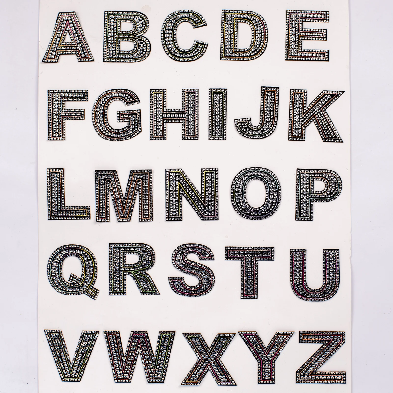
The A–Z board shows separate black uppercase forms with round clear stones. Close views reveal a small-stone perimeter, larger stones through the strokes and a fine reflective line between parts of the layout. Read those layers together: the pictured face contains more detail than two identical rows, and the black gaps are part of its appearance.
Reference measurements come from the catalog record. The current MOQ is 50 pieces; confirm specifications, price, and lead time in writing before production.
The large alphabet view and the close letter views answer different visual questions. Compare their layers before choosing how the lettering should read.
Follow the outside edge, reflective inset and inner stone field separately on the R close-up. Their different paths describe the bowl, counter and diagonal leg.
Dark textile remains between the bright elements. Compare that spacing at a straight stem and a rounded corner before requesting a denser-looking variant.
The alphabet board lets you compare I with M or W. Equal height does not mean equal visual width or the same amount of crystal surface.
Arrange the intended letters on a design proof and compare the spaces between their outlines. A curved side and a straight side can create different-looking gaps.
A photo key and annotated word proof describe the intended appearance. Character quantities, backing approval and shipment grouping belong in the separate purchasing specification.
Use the board to locate the character and a close view to identify the visible layers you want retained.
Mark outer stones, reflective inset and inner stones separately where the stroke turns or encloses a counter.
Review the gaps within a character and between neighboring characters on the intended word proof.
Keep the selected photograph beside the annotated composition. Record requested appearance changes separately from the original reference.
Compare the broad block strokes across a surname before selecting this style for a jacket layout; judge the word as one silhouette.
Place the letter proof against the bag's actual background color to decide how much of the black outline should remain visually distinct.
Compare repeated words at their intended viewing size. Keep the inset and stone field legible rather than relying on an enlarged single-letter photograph.
Use the requested word or name to settle character counts and finished height before the first letter is sampled. For the separate purchasing workflow, see Double-Row Crystal Letter Patch Orders.
Two nested stone rows trace every stroke instead of filling the letter as a solid crystal mass.
Black textile remains visible around and between the clear rows, sharpening counters and corners.
The pictured reference covers uppercase A through Z for initials, surnames, and short statements.
Buyers can quote the required count of each letter rather than treating the alphabet board as one motif.
No universal letter height is listed, so the quote must state the chosen scale, exact wording, and quantity of every character. For further detail, consult Double-Row Crystal Letter Assortments in Bulk.
Provide the exact word list and total needed for every character.
Choose the intended letter height and show its placement on the receiving item.
Check the paired crystal tracks and black spacing on a representative sample.
Approve the final A–Z allocation before the quoted production mix is packed.
Send your artwork, quantity, destination, and specifications for a tailored quote.